The Music Lesson, 1665 by Johannes Vermeer
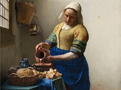
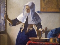
As she stands before a rough, white-plastered wall, the milkmaid assumes a dignity far in excess of the simple task she performs. She emanates a wholesomeness and a sense of moral purpose that stem from the steadfastness of her gaze as she carefully measures the milk into an earthenware bowl. These qualities also derive from the sheer physical power of her being, which Vermeer emphasized through the unusually bold modeling of her figure. Finally, they are augmented by the perspective of the window, whose orthogonals recede to a vanishing point just above her right hand, a placement that reinforces the significance, and permanence, of her gesture.
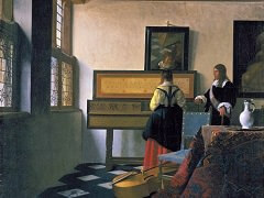
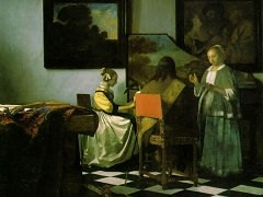
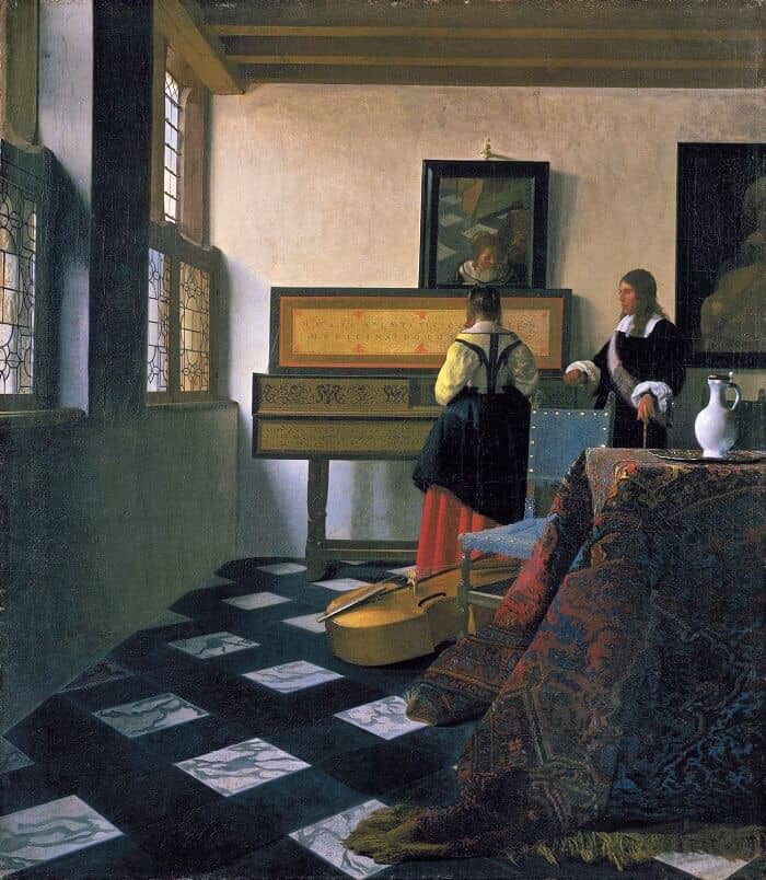
On the far side of a sunlit room with double windows a young woman stands to play on a clavecin. A man in elegant dress watches her and listens intently. Both figures are quiet and statuesque, as though the music were measured and restrained. Indeed, this painting is one of the most refined works in Vermeer's oeuvre. In it, figures, musical instruments, picture, mirror, table, tile patterns, and chairs, however realistically presented, are conceived as patterns of color and shape.
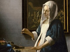
Such abstract design principles are generally associated with the twentieth century. One cannot approach this work, however, without realizing that Vermeer calculated his compositional elements every bit as carefully as did Piet Mondrian. The pattern of the roof beams, the repetition of black shapes on the back wall, the position of the table, chairs, and pitcher have all been painstakingly planned. Minor adjustments in the shapes of objects clearly testify to the artist's care about the precision of his composition. The pitcher on the table, for example, once had a thinner neck. Vermeer also adjusted the shape of the clavecin's lid to improve the composition. The lid is slightly wider to the right of the girl than it is to her left, a shift of alignment that lessens the tendency to visually connect the two halves of the lid design through the girl. Similar adjustments occur in at least two other paintings from this period: A Woman Holding a Balance, where he shifted the height of the bottom edge of the picture frame, and The Concert, where he adjusted the contour of the lid of the clavecin as it passes behind the standing woman.
Technical examinations have revealed that Vermeer initially painted the man slightly closer to the girl and then repainted his form in its present position. The girl's head also was once turned more toward the man. Its position was more like that in the mirror than it is now. By moving the man away and by turning the girl's head back, Vermeer succeeded in loosening their bond and allowed them to work more coherently in the total composition.
In this work, Vermeer actually gave us a clue that the scene was posed. We can vaguely perceive the shape of his easel and perhaps the artist's box in the mirror (middle right). Vermeer's implied presence thus gives the painting a different character from those in which the figures seem to exist in their own personal world. It makes the scene somewhat colder and more calculated. At the same time, however, it makes us aware of the intellect that went into its creation. However calculated the composition of this painting, it could not succeed without Vermeer's sensitive handling of light and color. Light floods the wall near the windows, but gently looses its force as it falls away from them. Shadows of objects, such as the mirror, are modulated because the light comes from different sources. Colors are also subtly adjusted according to the nature of the light that falls upon them. The letters of the inscription on the lid of the clavecin are ocher on the left of the girl but blue on her right. Similarly, the leading in the rear window is painted in ochers, but that in the adjacent window, against which the sky is seen, is blue.
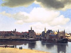
The vividness of the scene is also created by the textural effects evident in the painting. Just as Vermeer depicted the tile roofs of the buildings in the View of Delft with different textures of paint, so here he varied his textures when representing a chair, a tablecloth, a reflection in the mirror, or a white porcelain pitcher. The brass studs on the chair, for example, are so thickly painted that they actually protrude from the surface plane. Similarly, the blue fringe of the chair cover has a bumpy texture.
Vermeer painted the table cover with a variety of layers over a basic ocher layer he applied the blues, yellows, reds, and oranges that combine to form the pattern of the design. These colors have been carefully applied, some densely, some thinly, to suggest the nubby character of the material. His technique for painting the pitcher, however, is quite the contrary. In this instance the surface is smooth and few brushstrokes are visible. Finally, when he wanted to depict the veins of the marble on the floor, he used broad, flowing strokes that are remarkably free and abstract.
