The Milkmaid, 1658 by Johannes Vermeer
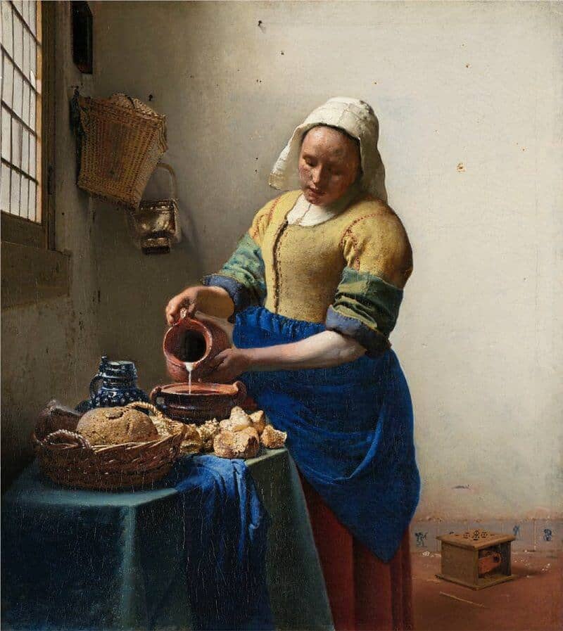
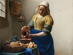
As she stands before a rough, white-plastered wall, The Milkmaid assumes a dignity far in excess of the simple task she performs. She emanates a wholesomeness and a sense of moral purpose that stem from the steadfastness of her gaze as she carefully measures the milk into an earthenware bowl. These qualities also derive from the sheer physical power of her being, which Vermeer emphasized through the unusually bold modeling of her figure. Finally, they are augmented by the perspective of the window, whose orthogonals recede to a vanishing point just above her right hand, a placement that reinforces the significance, and permanence, of her gesture.
Vermeer was a master at using light to enhance the mood and character of his images. Here, for example, he differentiated light on the rear wall to enhance the figure's three-dimensionality. He juxtaposed the bright yellow of the milkmaid's right shoulder to the shaded portion of the wall, while placing her shaded left shoulder against a bright backdrop. He then painted a white contour line along this shoulder to accentuate the figure's strong silhouette.
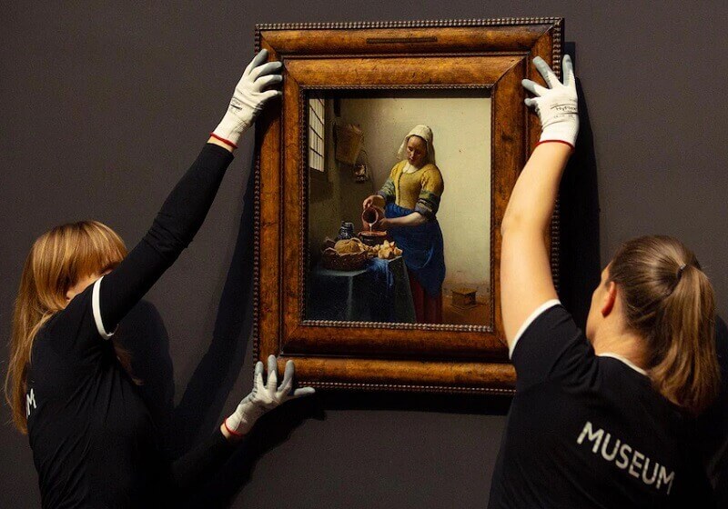
The most dramatic light effects occur on the table, where Vermeer evoked the textures of the earthenware bowl, jug, and basket, as well as the freshness of the breads, with an array of specular highlights. He created these with a complex layering of paints, often applied wet-in-wet. Yellow and blue are the dominant colours of The Milkmaid. The distinguishing feature of Vermeer's palette, when contrasted with those of his contemporaries, was his use of expensive natural ultramarine: this gives his blues here an exceptional vividness, in tune with his similarly luminous handling of lead-tin yellow. Yet the colour combinations in The Milkmaid are complex and various, and not limited to yellow and blue. The contrast in these colours is repeated in the rich contrast between the green of the tablecloth and the maid's carmine-red skirt.


